Transformation of a recreation room in a retirement home for people with dementia
The demographic change of our society gives us some challenges for the future: there will be a lot more seniors with special needs when it comes to living, medical care and a safe social environment. But the fact is that the elderly care is in a big crisis in Germany: Elderly care is expensive, specially educated care attendants are rare and the growing group of seniors is very heterogeneous and therefor hard to classify.
But what exactly is dementia? How do people with dementia change in their behaviour? What do they perceive? These are questions that will be examined during the first part of the bachelor thesis. Therapeutic approaches from the elderly care will be presented and will give an insight into dealings with people with dementia.
Further questions for this work are: How can the furnished environment and the therapeutic approaches be linked towards a better and healthier feeling for the people with dementia?
Further questions for this work are: How can the furnished environment and the therapeutic approaches be linked towards a better and healthier feeling for the people with dementia?
This concept and design is based upon a retirement home in Langenhorn, a suburban part of Hamburg. It has a living area for people with moderate and later stages with dementia, called “Living area 6”, where after visits and researches has been made an analysis upon the wellbeing and the interior design.
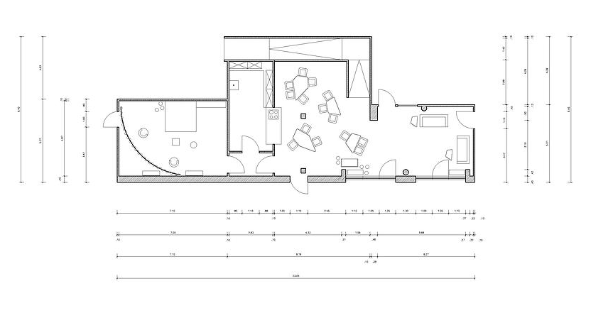
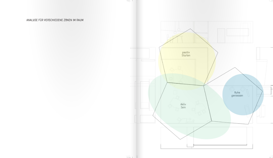
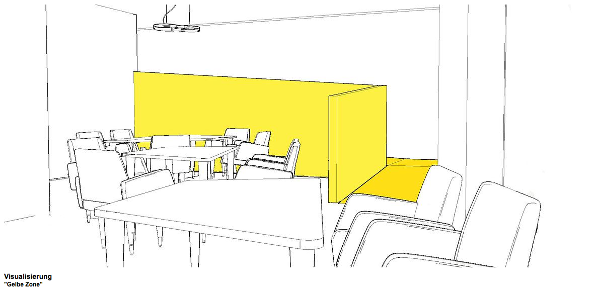
The concept of this work is to provide three zones in the recreation room. The zones are spread across the room. When you enter the room and walk down the yellow ramp with the light orange/yellow handrail, your senses pick up the positive mood that yellow reflects. Symbolically it represents the sun, light, energy and sensual stimulation. As the residents mostly walk down there in the mornings and after a nap, the activating feeling can kick start some into positive thinking and behaviour. This area is lighter than other parts and has an interesting light system half hidden under the ramp.
At the end of the ramp are two options available on how to use the room.
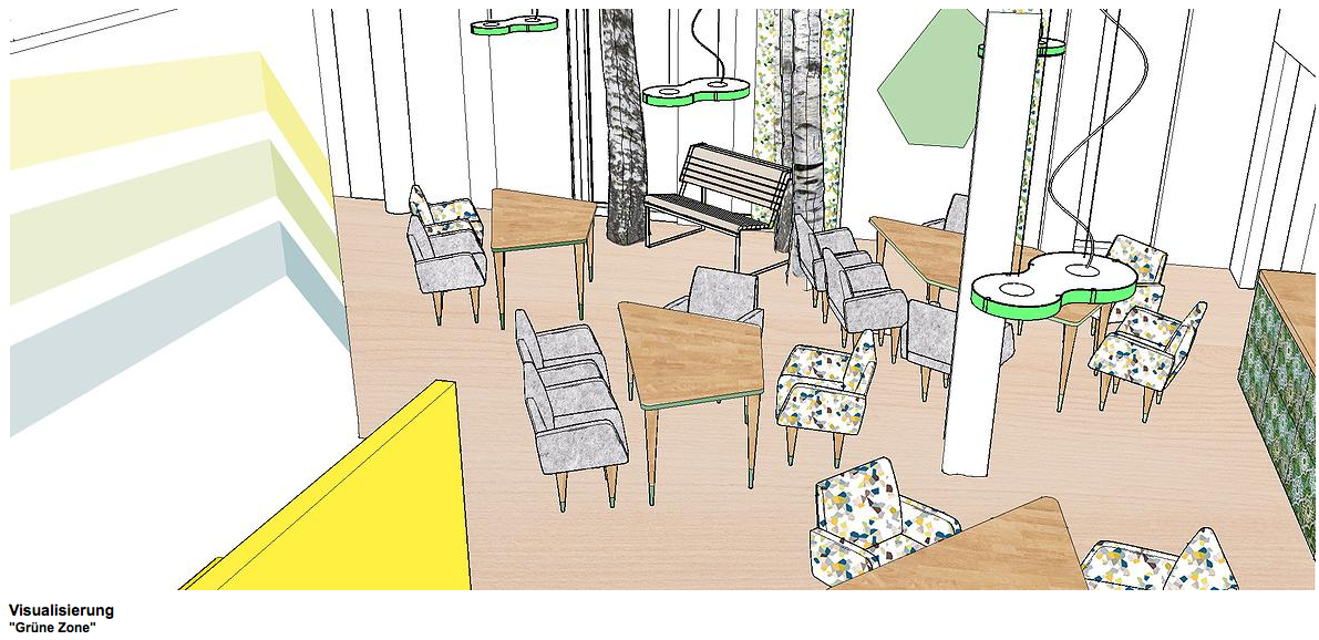
On the right hand side there is a restaurant-like area with the tables in different shapes and sizes. These allow a wider choice of how to eat, where to sit and what to see (viewing directions). This zone is designed with different shades of green. The colour green represents nature, freshness, but also hope and wellbeing. This is the perfect colour to enjoy a meal. The tiled kitchen bar that offers drinks and snacks highlights the restaurant feeling.
On the left hand side is the more relaxing part of the room, the ‘blue zone’. This area offers sofas to rest and nap and a light system, that changes, to reflect the diurnal rhythm by varying the colours from white in the morning to a more warm yellow for afternoons and evenings.
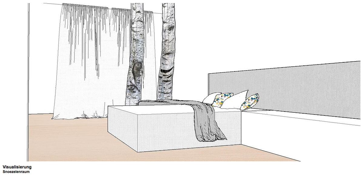
The adjoining music room also gets a makeover and is now a white therapy room for ‘snoezelen’. The storage space needed in the room is now hidden behind a big white curtain. The room has a big bed with an upholstered bench on the sides and two armchairs. From the ceiling hangs a projector that shows mood videos and music aligned to the therapy method in use.